PET PROJECTEveryone has one. Mine is a quadball team based in the Tri-State area: The Warriors.
The program was created in 2014 by three-time US National Team athlete and gold medalist coach Michael "Yada" Parada. Parada created the squad with two goals in mind: develop a program with long-standing potential and train a group of formidable athletes capable of bringing titles to the New York/New Jersey area.
Championship aspirations warrant a champion-caliber brand. Inspiration was taken from the historical powerhouse, the New York Yankees; the GOAT to many, LeBron James; and the namesake, the Nordic warriors.
Colors
Currently, The Warriors is one of two of the longest-standing US club quadball teams (10 years). It’s no mistake that blue was the first color to be added to our palette. It represents stability and commitment. However, it can create an unsettling feeling for others (re: competitors).
Black was next, a symbol of power and mystery, but it is balanced by our third color, white, which evokes hope and represents integrity.


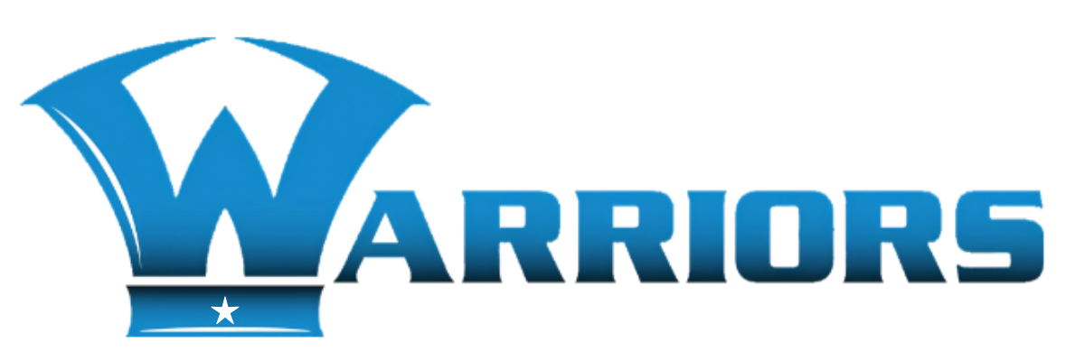
Logo
The original logo (top) depicts an axe laying on its side, a reference to a Warriors’ weapon. The font, Serpentine, is noted for having a “stone-like solidity”. We chose a font that appeared tough to crack, much like our team. The star was added in 2023 following our first national league championship title.
Uniforms
-
![]()
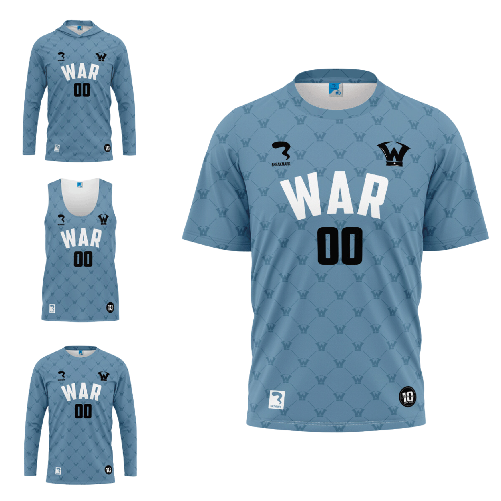
Warriors Primary (2014 - Present)
-
![]()
Warriors Secondary (2014 - 24)
-
![]()
Warriors Secondary (2024 - Present)
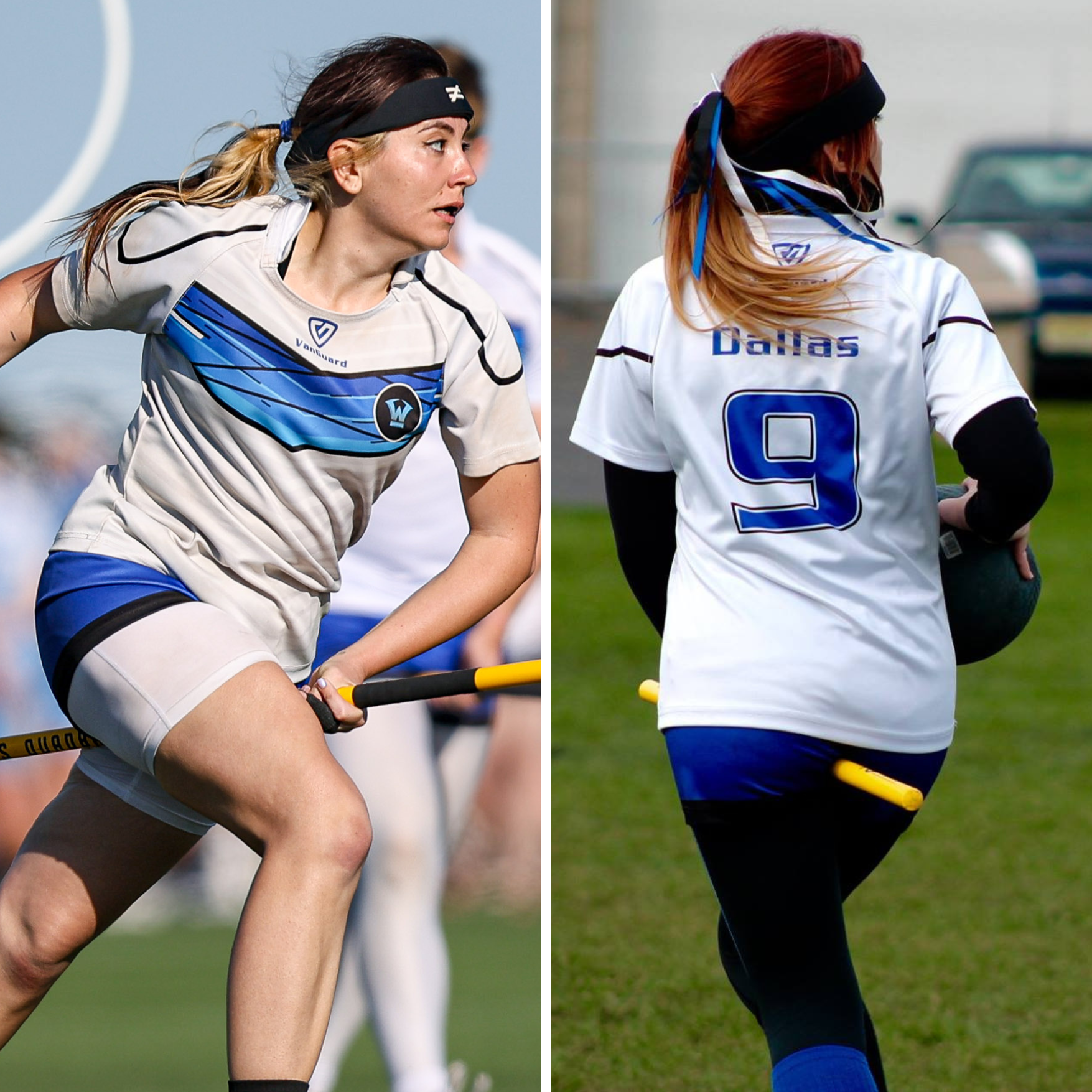
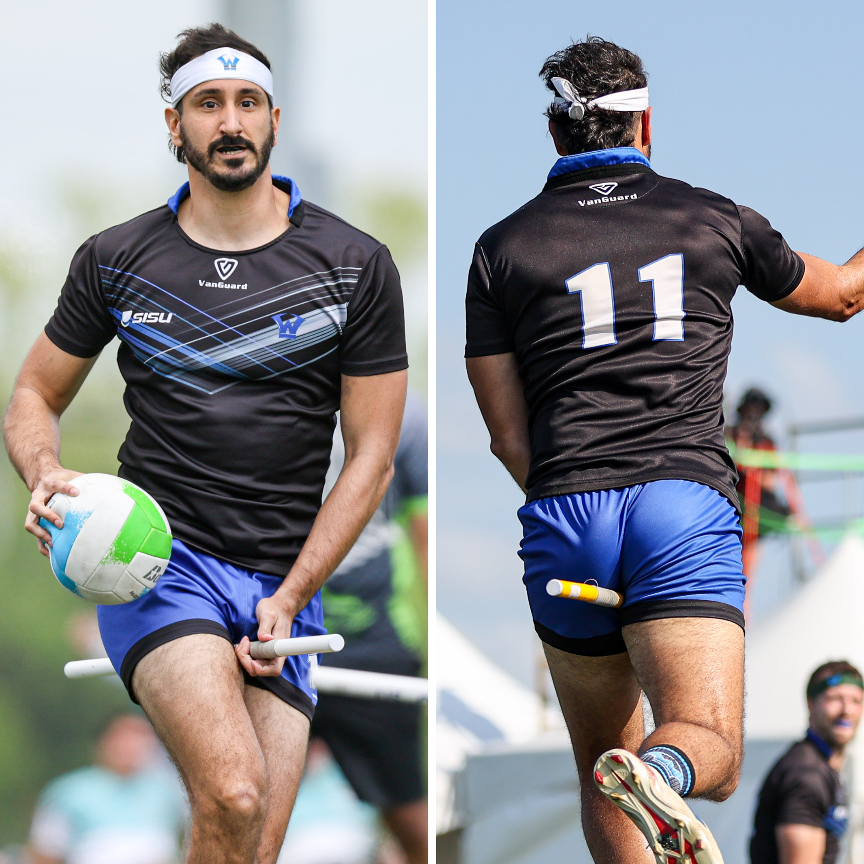
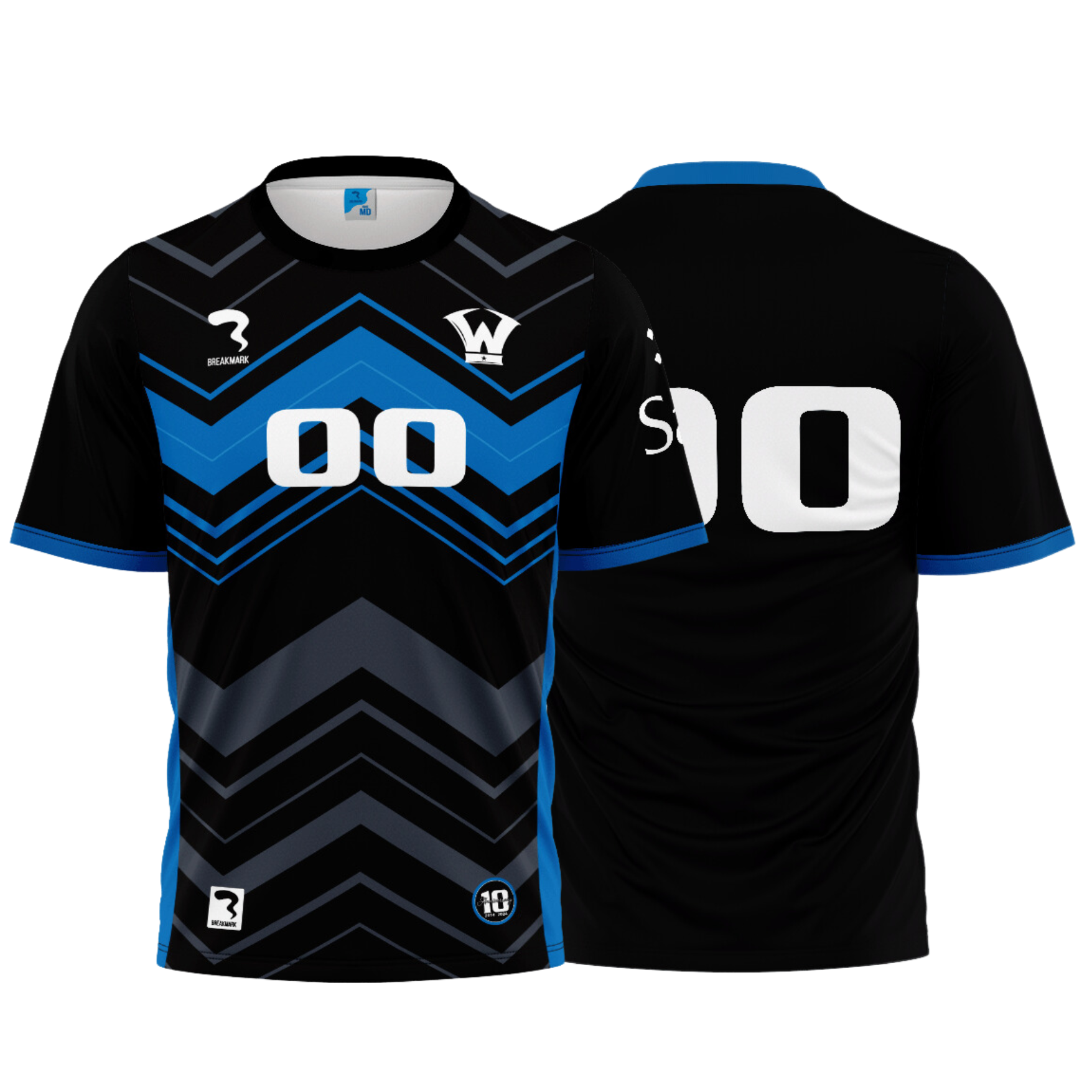
In a time when teams were still spray-painting T-shirts, duct taping numbers, or wearing matching Harry Potter-themed jerseys, I designed a uniform set that showed The Warriors had come out to play…and win.
The white kit is worn on day one of tournaments or at one-day events. Notably, there is a name on the back. The black kit is worn on day two when we enter bracket play on day two of tournaments. These jerseys do not have a name. There are two reasons for the name and lack thereof:
On day one, you meet us, by day two, you remember the name.
Individual stars can win the run of the mill game, but when there is a title on the line,
it’s about the team as a whole, not the name on the back.
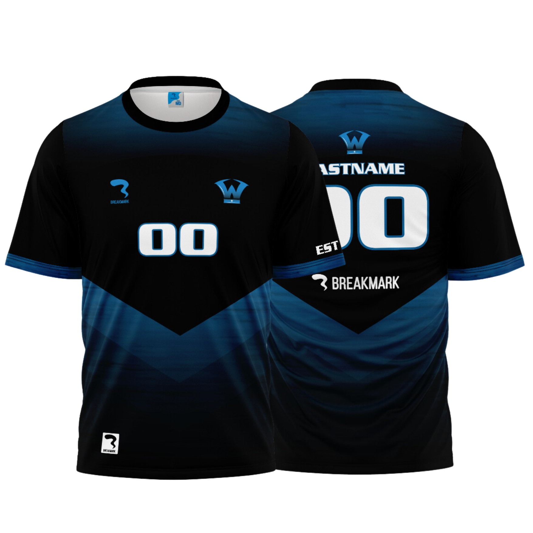
The V design seen throughout was inspired by traditional soccer kits, giving us a professional image that the sport was lacking, it also represented victory and triumph through perseverance. The blue rugby shorts were selected due to their durability. We are an athletic, hard-hitting team, and we needed apparel that would move with us. Those “short shorts” have become synonymous with our brand and carved out their own spot in quadball history.
Our uniform remained unchanged for nine consecutive seasons. This season, for our 10th anniversary, we will be replacing our day two jersey (concept by me, brought to life by Breakmark). Notably, the V design has morphed into a W, the first letter of Warriors, a team now synonymous with victory.
In addition to our uniforms, I’ve also had the pleasure of conceptualizing merchandise for the team throughout the years.
Apparel
-
![]()
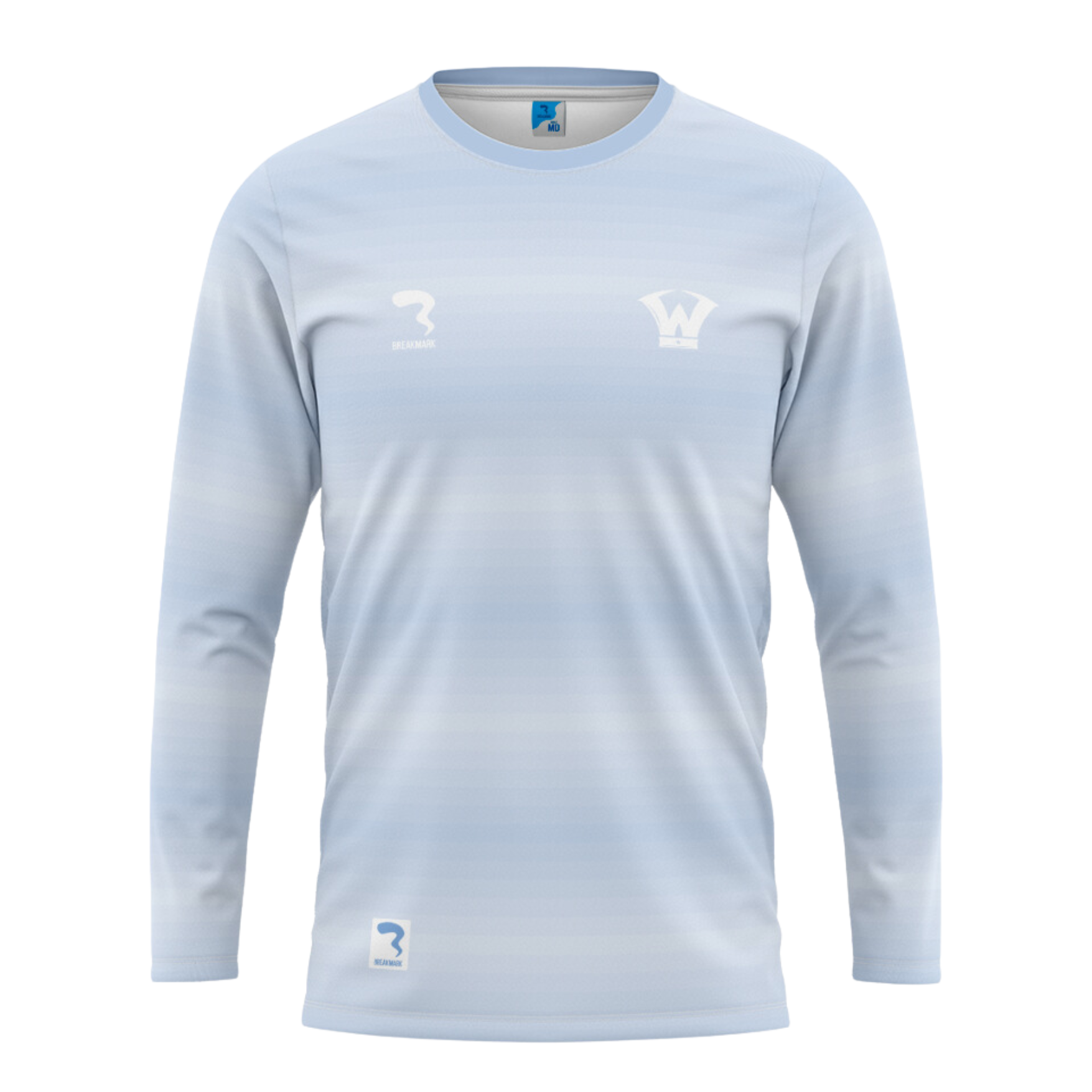
Warriors Steele Blue Warmup
-
![]()
Warriors Abyss Warmup
-
![]()
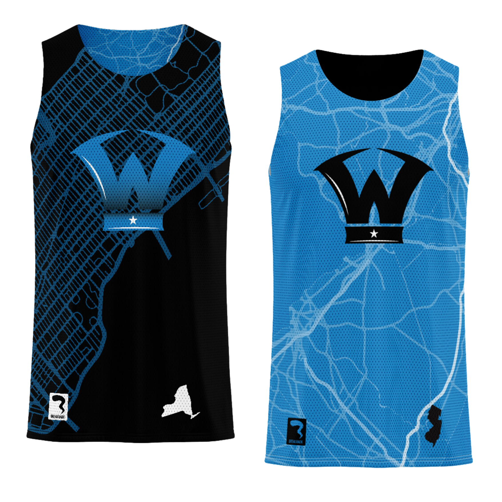
Warriors Tale of Two States Reversible
-
![]()
Winter Warrior Warmup
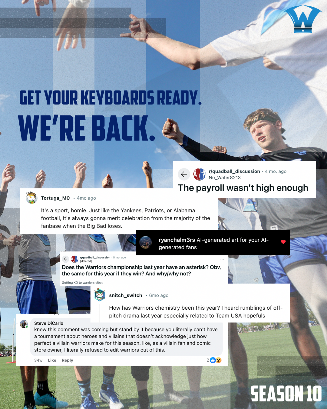
42-2
That’s our team record since the sport came to a halt in 2020 and remerged in 2022. It includes a national championship and multiple regional and local titles. In a classic case of sports, the more we won (win), the more others wanted (want) to see us lose.
And, thus, our current brand voice was born.
-
![]()
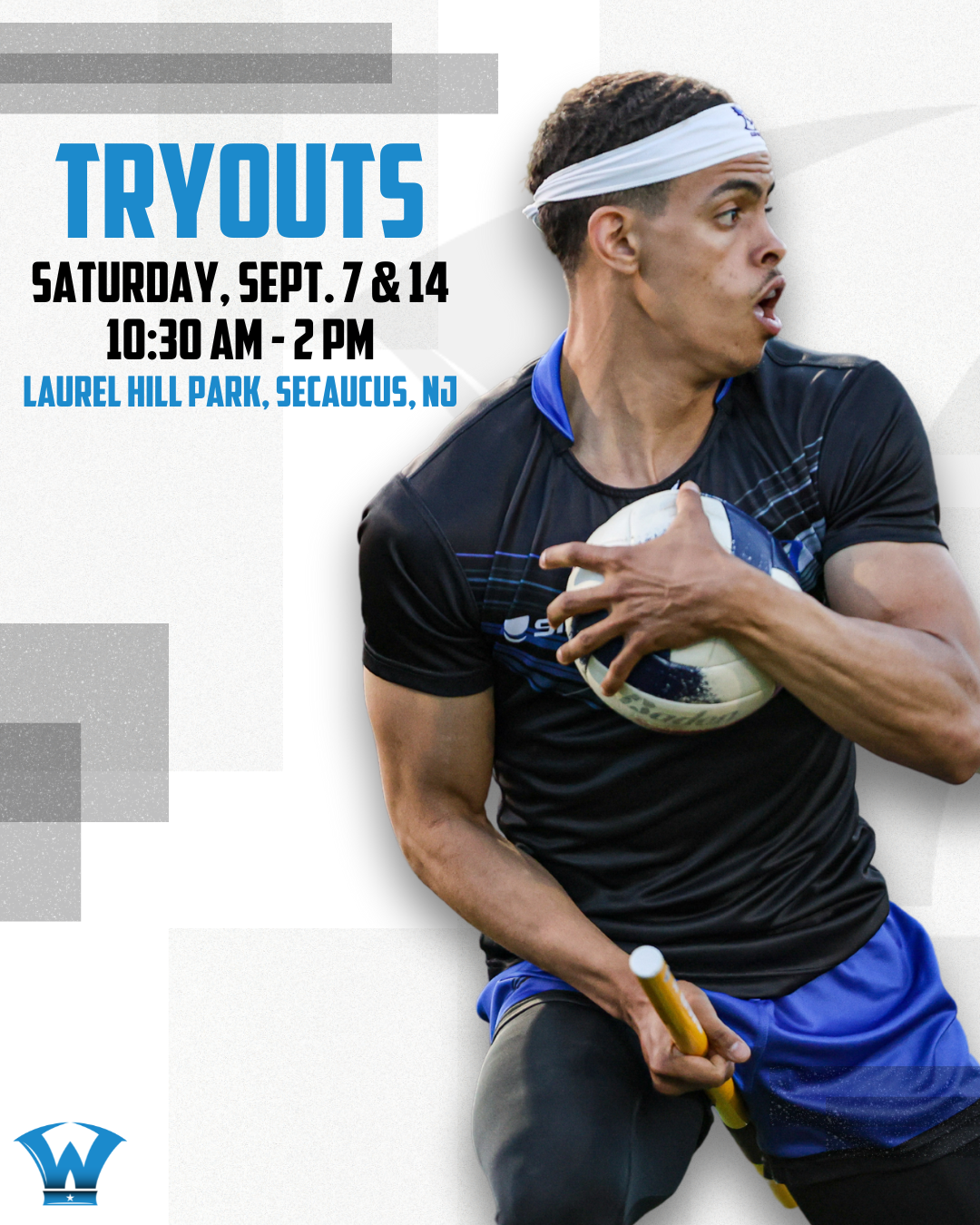
Tryout Teaser
-
![]()
Season 10 Announcement
-
![]()
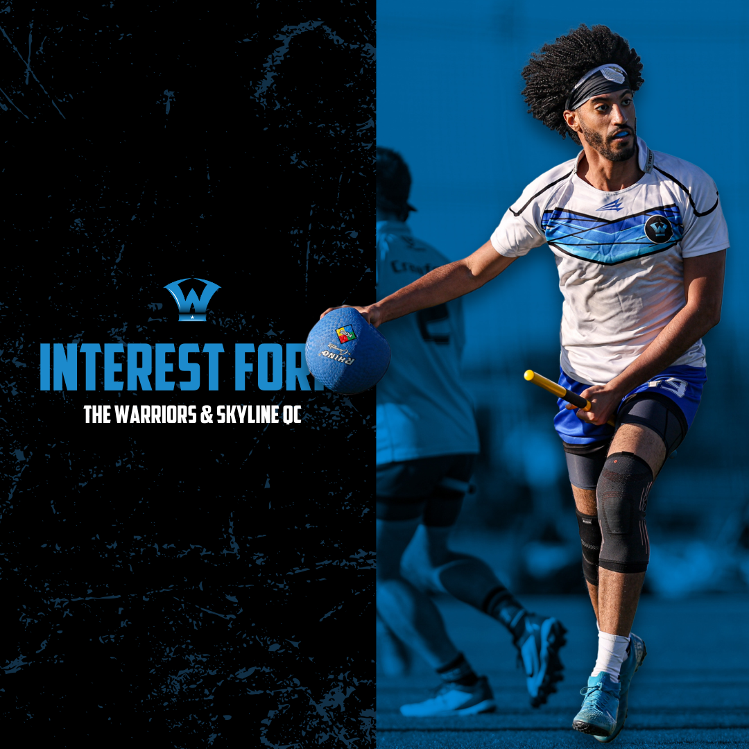
Interest Form Teaser
Web Design
Squarespace